Driving athleisure loyalty in APAC through cultural insights
Strategic research and client proposal for retail expansion.
Skip to the bottom for examples of the final interactive prototype.
Skip to the bottom for examples of the final interactive prototype.
(5 minute read)
The challenge
Team: Design strategist in a team of 3
Timeline: 8 weeks
Summary: Lead strategic research to identify cultural drivers of brand loyalty across APAC markets, resulting in data-driven recommendations for a retail expansion strategy.
Methods: Market research, consumer behaviour analysis, competitive landscape analysis, persona, user journey mapping, storytelling

A renowned athleisure brand needed to understand how cultural differences across APAC markets would impact their expansion strategy and loyalty approach - requiring us to move beyond Western-centric assumptions about consumer behaviour.
What we discovered
Research
Our hypothesis was that loyalty drivers would vary significantly across APAC cultures, requiring a market-by-market approach rather than a one-size-fits-all strategy.
To validate this, we:
• Identified 5 key cultural drivers where APAC and Western markets fundamentally differed,
challenging conventional loyalty assumptions
challenging conventional loyalty assumptions
• Synthesized insights across 7 loyalty catalysts (i.e. brand stickiness, perception of wellness
benefits, rewards system etc.) from consumer behaviour research with 75+ data points
benefits, rewards system etc.) from consumer behaviour research with 75+ data points
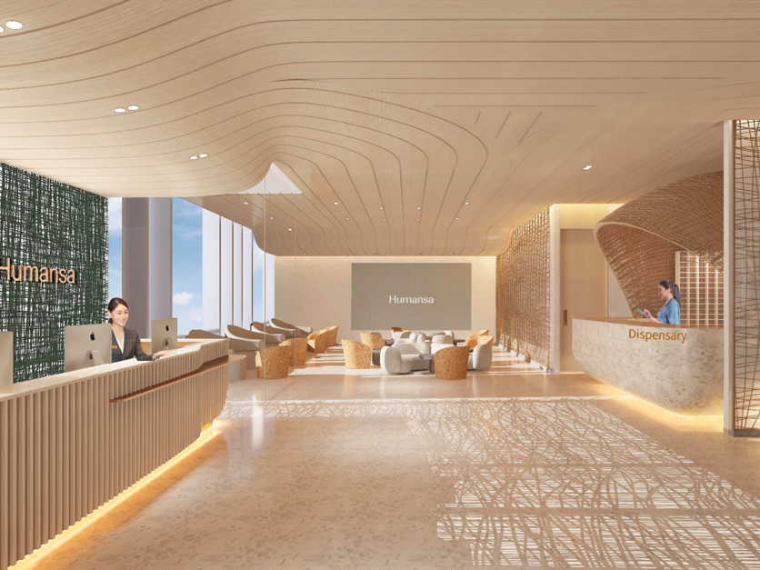
• Site visit to regional branches to evaluate the impact of physical touchpoints on the overall
customer experience, and opportunities to integrate digital interactions
customer experience, and opportunities to integrate digital interactions

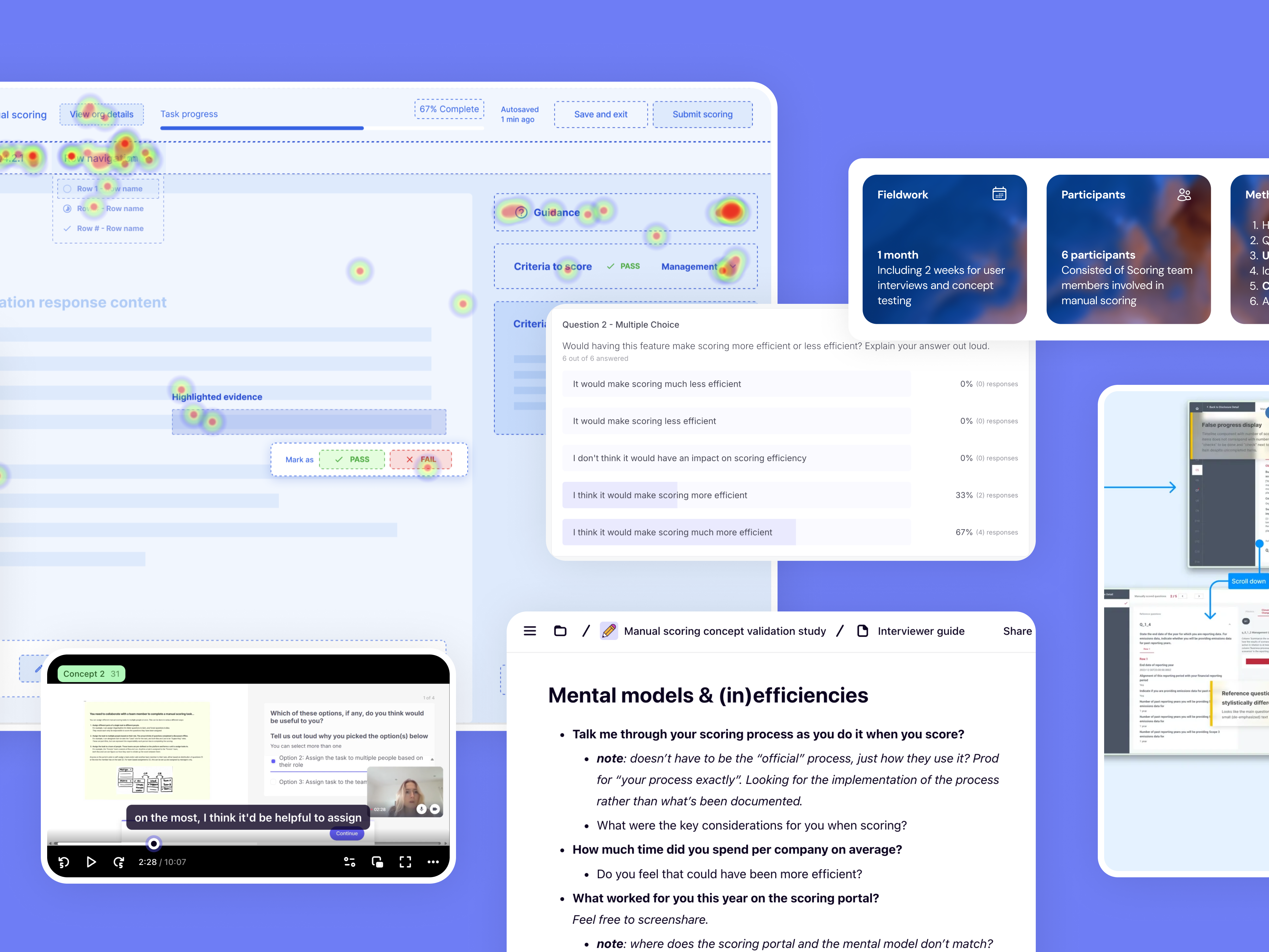
Research artefacts and insights synthesis board on Miro

Insights tree
What this meant strategically
Some examples of how we turned insights into business strategy:
(1) While Western markets respond to individual achievement rewards, our research revealed APAC consumers were more motivated by community status and family-oriented benefits - fundamentally shifting how the loyalty program needed to be structured.
(2) Unlike Western markets where wellness equals fitness gear, APAC consumers view wellness as holistic life habits and routines. This meant the brand needed to expand beyond product-focused loyalty to lifestyle-integrated rewards that reinforce daily wellness practices
(3) Our research uncovered that educator and guest relationships drive in-store experiences far more in APAC than Western markets. This suggested loyalty programs should prioritize community-building features and ambassador networks rather than purely transactional point systems.
Applying our findings
Our cultural insights framework aimed to be the foundation for the client's APAC expansion roadmap, with our strategic recommendations directly informing their market entry sequence and localized loyalty program development.
Design solutions
We determined the most viable 2 personas, mapping future-state user journeys that captured cross-platform touchpoint opportunities to trigger buying moments and boost loyalty.

Polished persona 1

Polished persona 2

Example user journey for one of our personas, "Jolie". Click to enlarge.
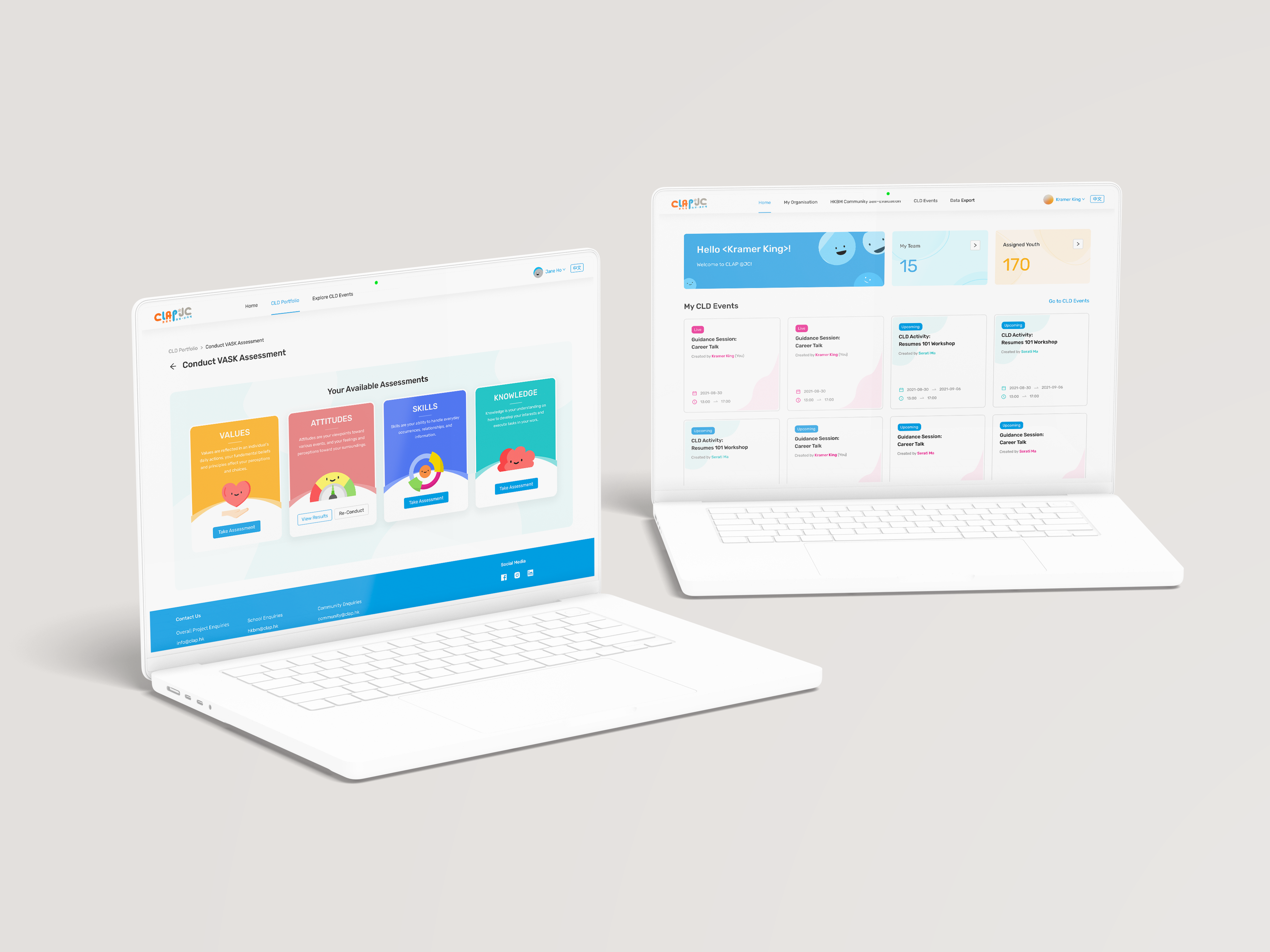
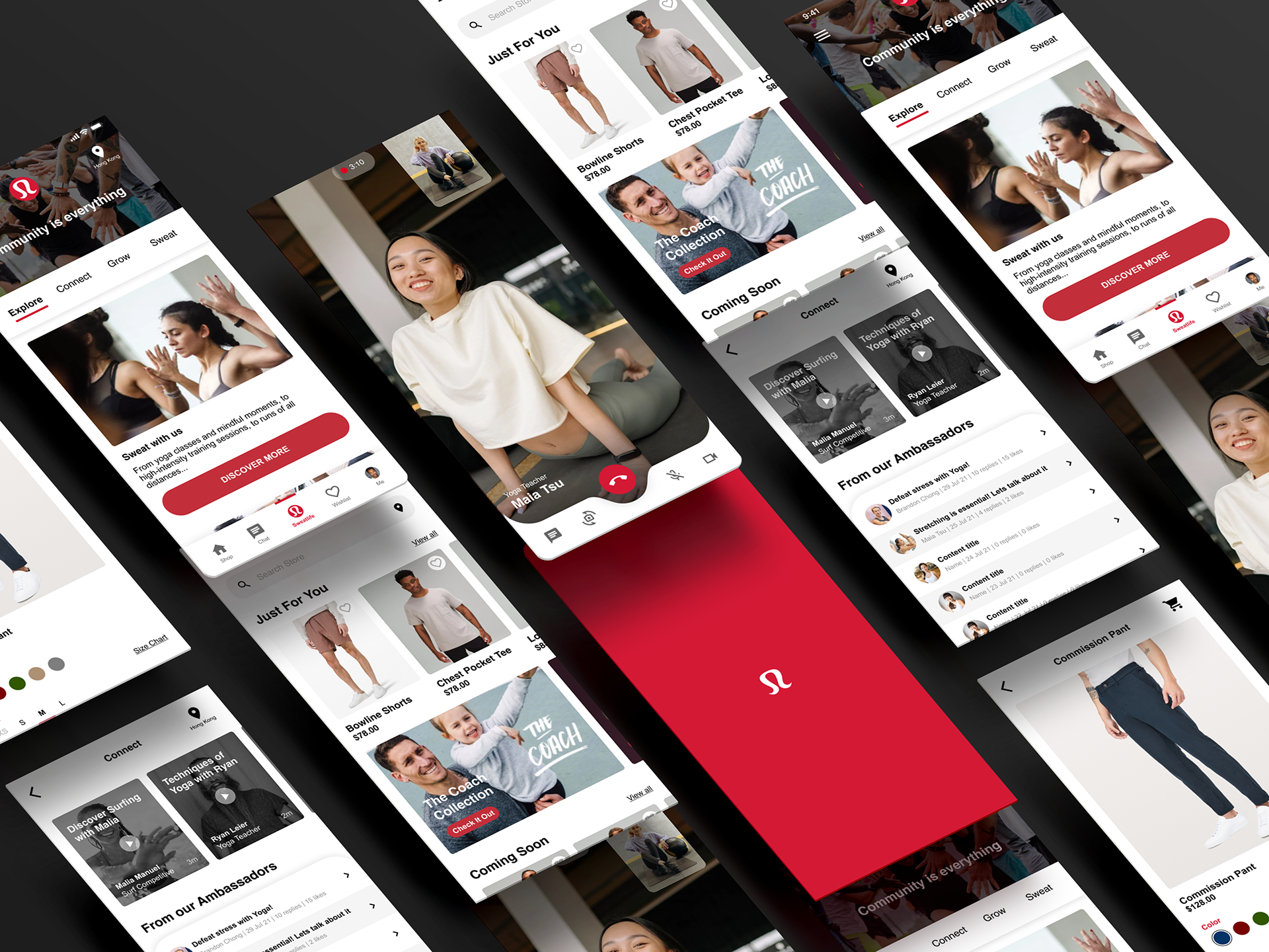
Next, we developed a strategic framework for a tiered loyalty program following a trigger, routine, and reward system. Our ideas were narrowed down (via rounds of converging ideas, dot voting, and critical analysis) to 4 key loyalty features, for which we created interactive prototypes to demonstrate how they would be surfaced on an iOS mobile app.
We also devised a new membership point system that integrates mobile app features to increase brand loyalty and continued sales, exemplified below:

Results
In the end, we delivered a compelling narrative and polished deck that secured client stakeholder buy-in for a high-stakes client! Other accomplishments include:
• Our strategic framework provided foundation for subsequent client discussions
• Successfully delivered strategic recommendations within tight 8-week RFP timeline
• Identified actionable opportunities for market-specific loyalty program adaptation
Sample prototypes and deck that we demoed live:
Learnings
Overall, I loved working on this project because it was a for a brand that I personally supported, and exploring a completely different market for its expansion allowed me to leverage my multicultural background as intuition when we need to explore the idea of 'localization' deeper.
I also learned:
• Cultural assumptions about loyalty and wellness run much deeper than what's on the surface.
What will truly makes a difference requires fundamental shifts in strategy rather than just
localization tweaks.
What will truly makes a difference requires fundamental shifts in strategy rather than just
localization tweaks.
• This project taught me to lead with hypothesis-driven research questions rather than broad
exploration, making insights more actionable for business decisions.
exploration, making insights more actionable for business decisions.
• Given more time, I'd love to conduct in-person ethnographic research in key markets to better
understand the physical retail experience and community dynamics firsthand! This time around,
I only got to do some light guerrilla research without the authenticity of an ethnographic,
observation focused approach.
understand the physical retail experience and community dynamics firsthand! This time around,
I only got to do some light guerrilla research without the authenticity of an ethnographic,
observation focused approach.