Supporting youth development
from classroom to career
from classroom to career
Designing Hong Kong’s first cross-sectoral career platform, connecting 100,000+ students with digital tools and support networks to explore individual career pathways
(8 minute read)

Overview
CLAP is a charity program that aims to help Hong Kong’s youth discover their passions and abilities by exploring multiple pathways to a fulfilling adulthood, and widening the discourse on what it means to be ‘successful’. ("E-platform" is the shipped product I worked on, live since 2021)
Role: Product Designer in a team of 4 designers, 2 Business Analysts, 10+ Developers, Project and Account Manager across EMEA and APAC.
Timeline: 16 weeks
Objective: Design a sustainable, cross-disciplinary solution to increase youth engagement in career development activities and support administrative needs.
How might we enable cross-disciplinary collaboration between staff (teachers, social workers, employers, researchers) to increase youth engagement and support them to develop their careers?
How might we enable cross-disciplinary collaboration between staff (teachers, social workers, employers, researchers) to increase youth engagement and support them to develop their careers?

Planning
Here's a look at the project timeline and schedule shared with clients. Every fortnight we'd have regular client calls to share work in progress and updates, helping to build a trusting relationship.

Rough week-by-week calendar of staff onboarding, epics and main activities. This was the design-team-only version, and does not include the simultaneous work from BAs and Dev teams, following an agile workflow.
Information architecture
As a project a decade into making, there were loads of documentation from the client detailing the program, objectives, stakeholders, and their various requirements.
We digested all of this information and transformed it into an information architecture that would later help us structure the platform:
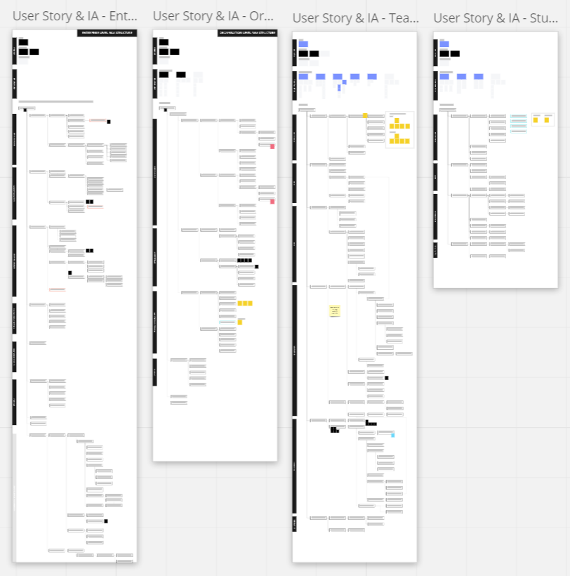
Sample IA, zoomed out

Sample IA, zoomed in
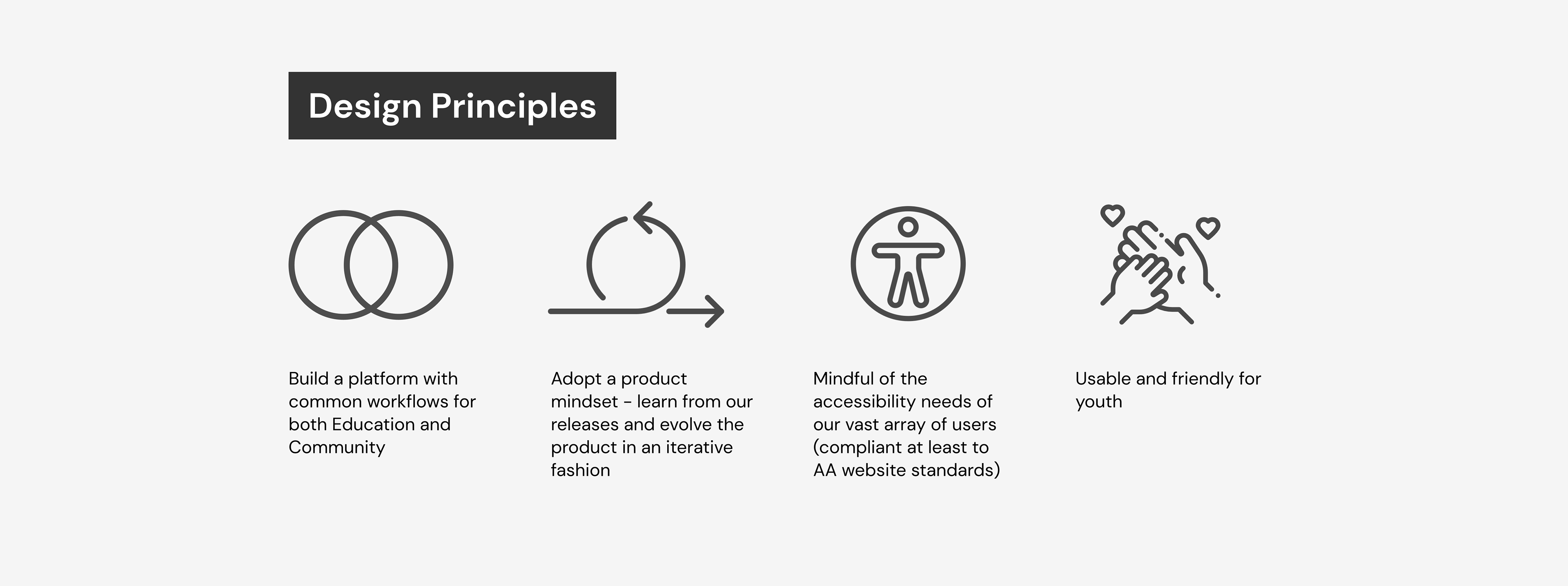
Design principles
Given the platform's need to serve diverse user groups (students, educators, social workers, employers), we prioritized inclusive design meeting WCAG 2 Level AA standards while ensuring the interface remained intuitive across different technical literacy levels.
These principles helped us weigh tradeoffs and make design decisions later on.
Designing
Events epic design thinking
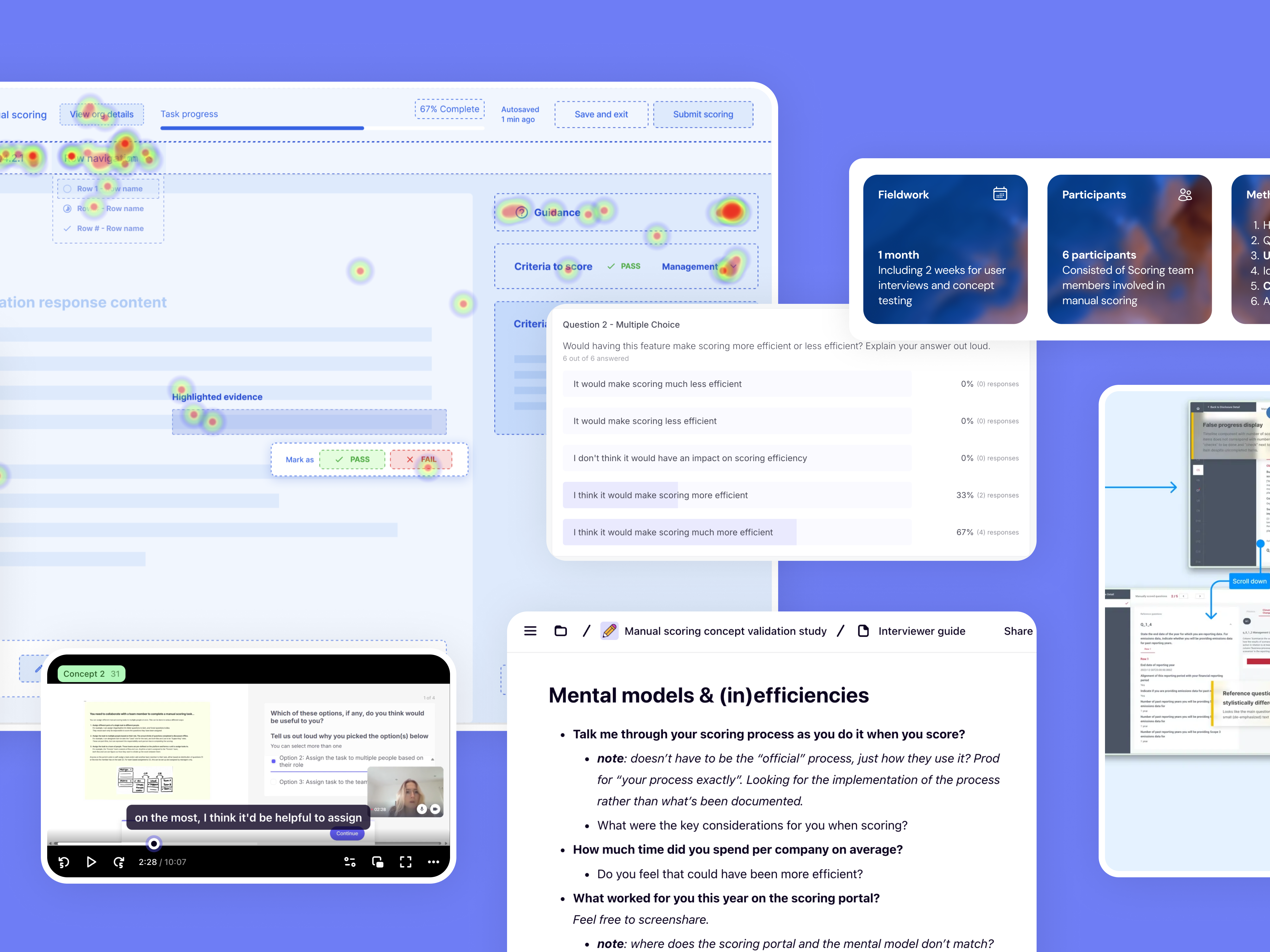
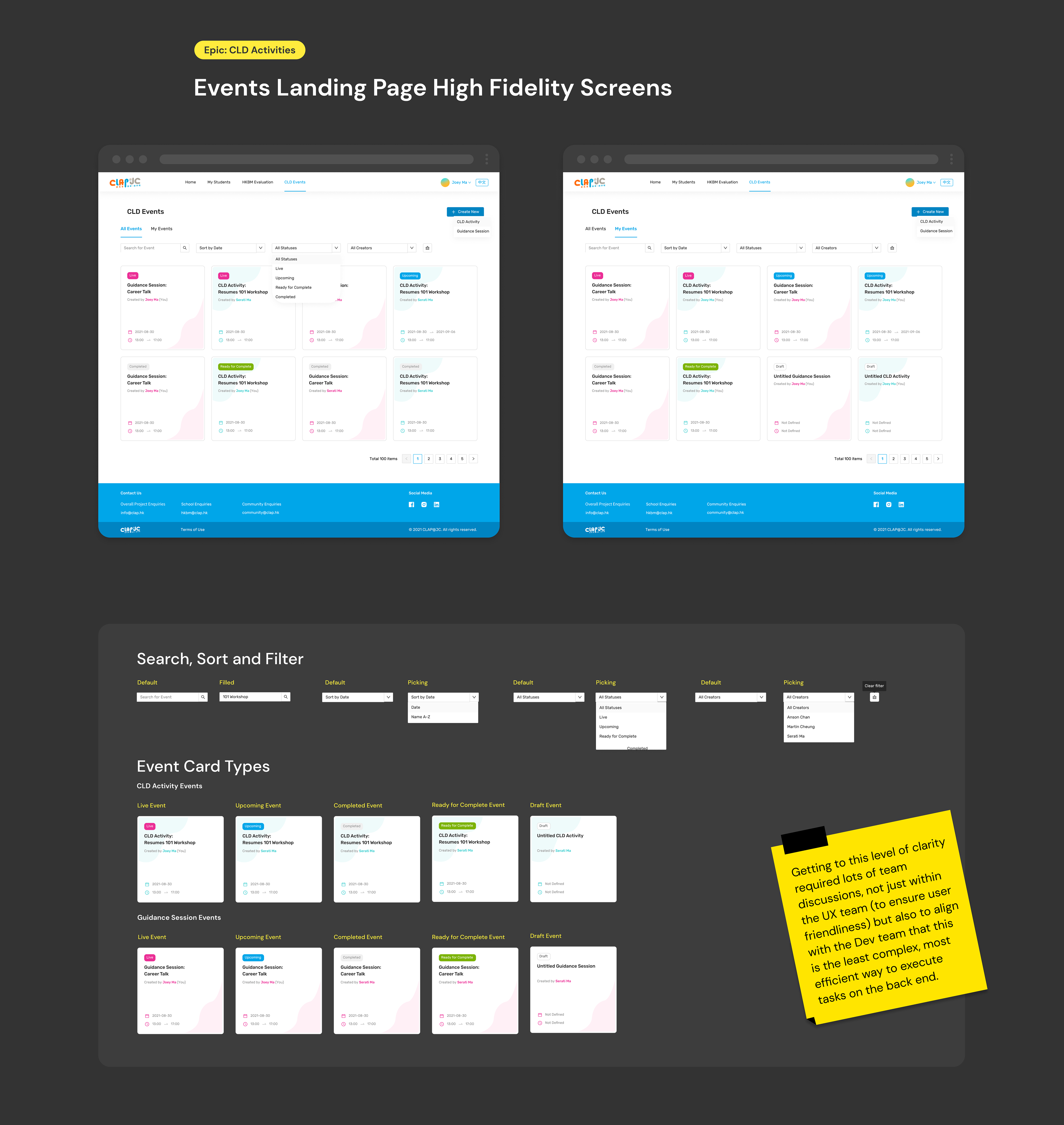
This epic was the core of this program, from creating career learning activities and counselling sessions with students, to executing all related event management tasks for admins.
Events required complex state management (draft, published, live, ended) across multiple types (recurring, private/public, online/offline). After several design crit rounds, we decided that rather than overwhelm users with this complexity, we should have a progressive disclosure design that surfaced relevant options based on user context and event lifecycle stage.
This would later become a guide for event card components and their corresponding tags, filters, and page navigation.
Iterative wireframing
Through collaborative wireframing, we iterated on the events landing page layout to balance information density with scannability. We tested different card arrangements and filtering options to ensure users could quickly identify relevant events across the complex mix of event types and states.
Using tabs as a secondary navigation and pagination once the event cards reach the fold also helped limit cognitive load the user has to process at once.

Organising event states and types

Wireframe drafts and feedback collected from other designers
Adhoc collaboration (team brains > one brain)
Reaching high-fidelity required lots of thinking, experimentation, and communication. Working across distributed teams and timezones, we leveraged Figma's collaborative features—including cursor chat and audio—for real-time design iteration and rapid feedback cycles.
We often had productive debates over how to make flows more intuitive, or the best way to help the user achieve a task.

Working with design systems
We used AntDesign’s design system to get a kickstart on the project, and I quickly adapted to learn when and how to apply components appropriately throughout our designs, understanding when existing patterns would suffice versus when custom solutions were needed.
For more complex interactions like participant selection (pictured below), we worked together to craft bespoke UX patterns that still retained the visual consistency within our design system while still solving unique user challenges.
Here's an interesting UX challenge:
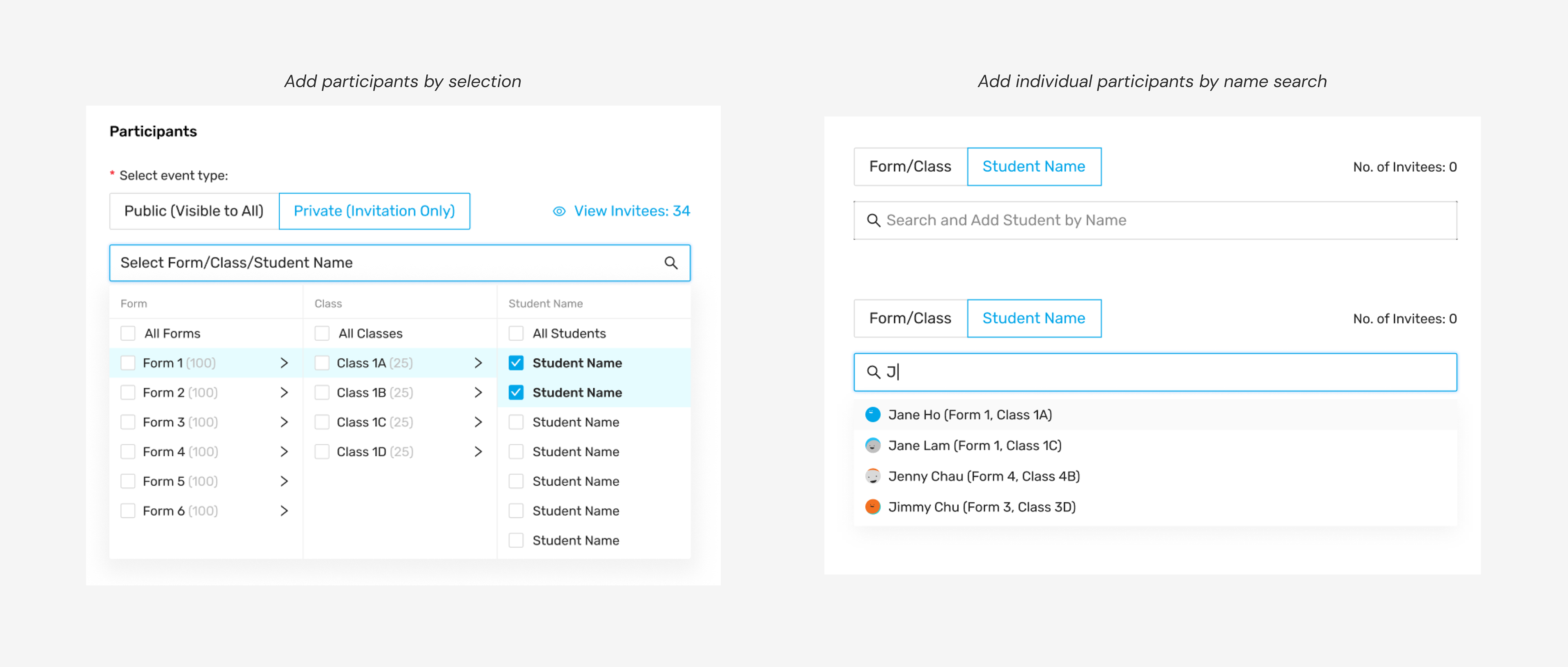
Complex participant selection flow: Balancing bulk selection (by grade/class) with individual search while managing interaction states, selected participant display, and real-time list updates across events of varying scales.
Balancing design system adherence vs thoughtful customization was crucial to ensure we could continue to scale the designs to accommodate future expansion.
Eventually, we got to these high fidelity screens, an example shown for the events landing page:
Pivoting
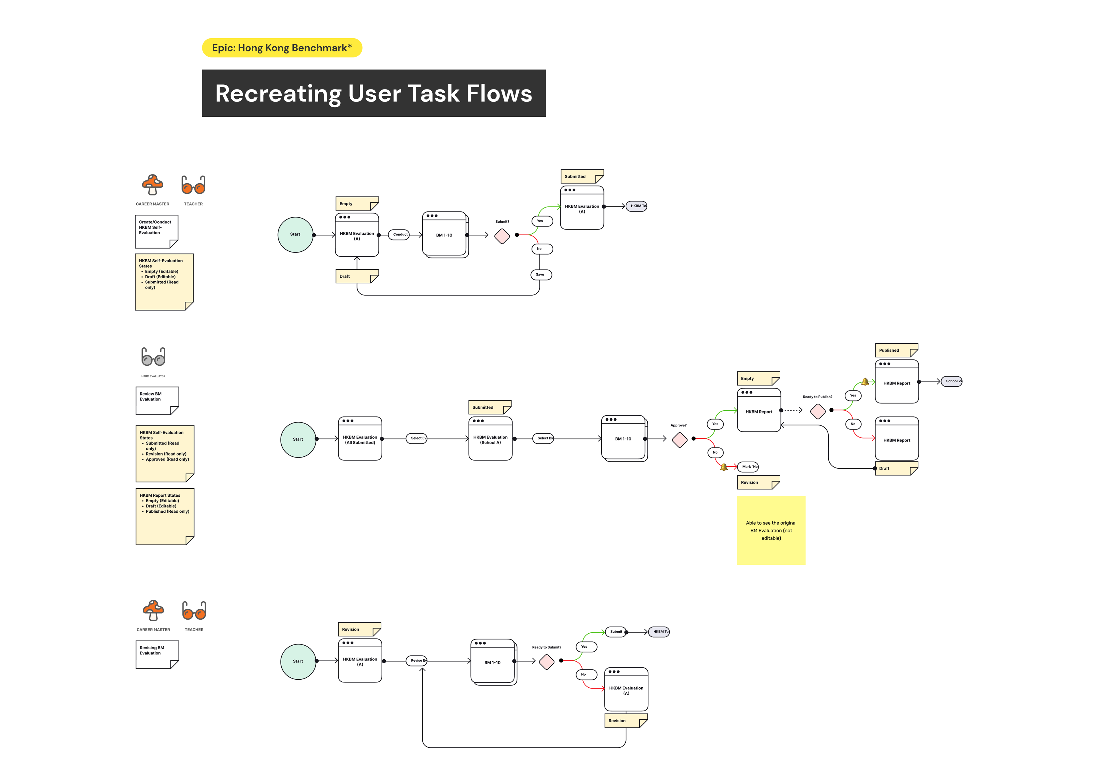
No project is perfect — nor was this one! When new client requirements suddenly surfaced that fundamentally changed a key user flow, we pivoted strategically rather than forcing existing designs to fit new constraints.
Returning to the drawing board, we restarted by clearly articulating updated user goals before moving onto new user task flows for different user types. We knew we needed to do it properly, a tradeoff against rigid adherence to project timelines and ideal process. But, our flexible design approach ultimately worked in our favour because it saved development time by ensuring we built the right solution rather than iterating endlessly on the wrong foundations.
Cross-functional collaboration
Halfway through the project, miscommunications with development and BA teams led to approved designs being rejected due to implementation constraints on an already overstretched dev team. Rather than viewing this as a setback, we flagged it as a process issue and used sprint retrospectives to build mutual understanding of each team's constraints and capabilities.
Our friction ultimately made us stronger, teaching me that empathy extends beyond users to teammates, and that understanding everyone's constraints leads to more feasible outcomes.
Each sprint, we worked better together than the last.
Each sprint, we worked better together than the last.
Balancing trade-offs
Recognizing our young student users needed encouragement rather than another academic chore, I proactively explored delightful UI enhancements and engaging, emotional visual elements that could increase platform affinity and long-term engagement:

These were saved as parked ideas and inspiration for future features.
Outcomes
Learnings
We learn and grow from each experience. I, too, have certainly learned lots! Now, onto the next one...

Impact
Here's what we achieved:
• Created a digital platform supporting 133 secondary schools across Hong Kong's first cross-
sectoral career development initiative, with digital tools reducing admin work time for teachers
sectoral career development initiative, with digital tools reducing admin work time for teachers
• Designed for 4 distinct user groups (youth, educators, social workers, and enterprises) with
varying needs:
varying needs:
• Serving 100,000+ students through streamlined digital career planning and engagement
tools, connecting them with 3,700+ employers to increase career mentorship matches; and
tools, connecting them with 3,700+ employers to increase career mentorship matches; and
• Enabling 13,000+ educators and social workers to deliver personalized career guidance at
scale and improve program completion rates
scale and improve program completion rates

As featured in the local news, student Alex benefited from the platform to realise his dream of becoming an e-sports professional, without being forced to fit into a traditional mold of ‘success’ (pressures that take a massive toll on young people’s mental health in Hong Kong). I’m so proud of him for finding his way!
At the end of the day, while I'm happy to showcase this work as a case study in my own career, what really matters is that this work helped make a real difference in young people's lives.
The platform's reach across 100,000+ students means that thoughtful design decisions had genuine impact at scale, which is rewarding...
... And a great reminder for why I love to do what I do.